Complete guide to maps: Difference between revisions
Page created, missing all pictures |
added missing pictures |
||
| (18 intermediate revisions by 2 users not shown) | |||
| Line 1: | Line 1: | ||
<big>''Renegade X'' - Technical Guidelines</big><br />'''A comprehensive guide to efficient and optimized maps for RenX''' | |||
= | [[File:Giphy.gif|center|thumb|500px|Created by a massive idiot aka Havoc89 =D]] | ||
__TOC__ | |||
==Introduction== | |||
Welcome to a guideline for Renegade X | [[File:Drnick1.gif|frameless|right|250px]] | ||
Welcome to a guideline for ''[[Renegade X]]'' and UDK map creation. This documentation is intended to very roughly cover problem areas that most hobbyists will likely miss. These are common mistakes and issues that non game developers face when trying to mod any game. Game engines are a technical marvel, and a lot of insanely smart people somehow make magic happen and create tech that can make entire worlds come alive in real-time. | |||
A lot of very technical solutions are employed inorder to make that possible. Most of these are things modders will never have to worry about. However the more you are aware, the better off you’ll be. No one is expecting you to know everything so you shouldn’t feel bad about not knowing something basic. Even professional developers are oftentimes unsure about how it all works sometimes. | A lot of very technical solutions are employed inorder to make that possible. Most of these are things modders will never have to worry about. However the more you are aware, the better off you’ll be. No one is expecting you to know everything so you shouldn’t feel bad about not knowing something basic. Even professional developers are oftentimes unsure about how it all works sometimes. | ||
| Line 14: | Line 15: | ||
What does this cover? I will be covering basic principles in both the technical and <s>artistic</s> side of game development and more specifically map/level creation. I have also created categories so that you can jump between different topics by following the document outline on the left side of Google Docs. For those of you who are interested in taking a deeper dive into UDK, then I highly recommend you go through the official documentation. | What does this cover? I will be covering basic principles in both the technical and <s>artistic</s> side of game development and more specifically map/level creation. I have also created categories so that you can jump between different topics by following the document outline on the left side of Google Docs. For those of you who are interested in taking a deeper dive into UDK, then I highly recommend you go through the official documentation. | ||
==Technical Guidelines and Practices== | |||
== Technical Guidelines | ===Overview=== | ||
Most hobbyists will approach level creation from a purely visual standpoint. It's easy to assume that level creation is really just about smashing objects together, adding in lights and particles and calling it done. It can become very easy to get carried away with a purely visual sense as it feels very natural. However game engines are all about efficiency. But don’t worry about not getting it right away, even professionals get it wrong sometimes. '''So don’t be nervous and don’t skip this section!''' | |||
=== Overview === | |||
From a professional standpoint, every map is optimized to squeeze out as many frames as possible. This can mean anything from using fewer objects, to deep diving into profilers that scan and graph out exactly what every part of your game is doing on every component of your computer. I won't be covering any profilers in this documentation as that isn’t an area most hobby modders and mappers are interested in. Now let's get started! | From a professional standpoint, every map is optimized to squeeze out as many frames as possible. This can mean anything from using fewer objects, to deep diving into profilers that scan and graph out exactly what every part of your game is doing on every component of your computer. I won't be covering any profilers in this documentation as that isn’t an area most hobby modders and mappers are interested in. Now let's get started! | ||
== Performance | ==Performance and Optimization== | ||
You’ve made a cool looking map and are excited to play. You hit play but… you’re only getting 20 frames per second… WHAT!? Performance and optimization is a critical part of map creation. Sometimes it means compromising on your visuals, but more often than not; it’s more about how low you can go before anyone starts to notice. | |||
First thing to note is UDK is an outdated engine in 2021. Unreal Engine 3 first made it’s production release game debut in 2006. It has been updated significantly since it’s humble beginnings, and the UDK specifically was roughly completed by around 2011 with minor hotfixes till 2015. | |||
What this means is that the UDK (aka Unreal Engine 3) is a very out-dated game engine that is not going to be able to take full advantage of any modern beastly hardware. The game engine was also made to support '''Xbox 360 and PlayStation 3'''. This is a game engine from yester-year and will need to be handled in a more delicate manner. | What this means is that the UDK (aka Unreal Engine 3) is a very out-dated game engine that is not going to be able to take full advantage of any modern beastly hardware. The game engine was also made to support '''Xbox 360 and PlayStation 3'''. This is a game engine from yester-year and will need to be handled in a more delicate manner. | ||
| Line 31: | Line 30: | ||
As an example, you probably have seen the “Ran out of video memory” crash bug in Renegade X especially with the 32bit client. UDK also doesn’t fully utilize 64bit since at the time it was still a pretty new thing 10 years ago. So optimizing maps for Renegade X is absolutely critical! | As an example, you probably have seen the “Ran out of video memory” crash bug in Renegade X especially with the 32bit client. UDK also doesn’t fully utilize 64bit since at the time it was still a pretty new thing 10 years ago. So optimizing maps for Renegade X is absolutely critical! | ||
== Memory Usage | ==Memory Usage and Size Management== | ||
====Understanding Video Memory for Textures==== | |||
==== Understanding Video Memory for Textures | I’ll be honest here… I dont understand it either, and I’m definitely not qualified to be talking about it. However I’m going to explain it the way one of my professors did. An easy to digest visual aid that made “''sense''” kinda... Granted this was explained to me 12+ years ago so things may be very different now. If you know more about this topic, then please correct me. | ||
Video Memory or VRAM as it’s known kinda looks like this: | Video Memory or VRAM as it’s known kinda looks like this: | ||
[[File:Vram.png|frameless|center|500px]] | |||
Memory management in game engines can be explained as a series of really large empty square textures. There are MANY of these really large and empty textures. The more of these you have the larger your hardware’s memory capacity is. | |||
[[File:Vram2.png|frameless|center|500px]] | |||
Game textures are stored in these large empty textures and assembled like a jigsaw puzzle, except it's all in the shape of squares and rectangles. Game engine tries to fit as many game textures as possible within each block. | |||
Game textures are stored in these large empty textures and assembled like a jigsaw puzzle, except it's all in the shape of squares and rectangles. Game engine tries to fit as many game textures as possible within each block. | |||
[[File:Vram3.png|frameless|center|500px]] | |||
However sometimes memory can have empty space left over if there simply isn't a texture that is the correct dimensions to be able to fit within that empty space. So memory can go to waste if mishandled. | However sometimes memory can have empty space left over if there simply isn't a texture that is the correct dimensions to be able to fit within that empty space. So memory can go to waste if mishandled. | ||
[[File:Vram4.png|frameless|center|500px]] | |||
In the above image, the square on the right shows textures that are not a power of 2 (256, 512, 1024, etc..) but rather arbitrary sizes. This can end up not filling up the entire available room on that memory block. As a result part of the memory’s capacity will go to waste. This is why it's always important to follow power of 2 sizes in your textures and in your '''light map resolutions.''' | |||
Now imagine all of these blocks essentially acting as a file size of a full sized texture that fits in that block. Multiply that by the number of blocks, and that is how you get the capacity on your GPU’s video memory. So for example 4GB of VRAM equals some massive number of empty texture blocks. | |||
'''But why does this matter you might ask''', UDK can only import power of 2 textures anyways. Yes this is true, UDK can only import power of 2 textures, however there are other “texture types” that aren’t restricted to this rule. '''LIGHT MAPS!''' I’ll be going over this a little further down in this documentation under debug views. For now keep this idea in the back of your head. But first let’s cover a major issue mappers face in Renegade X that’s related to video memory. | |||
One of the biggest reasons to see the “'''Ran out of video memory'''” issue in RenX is due to the amount of data that needs to be loaded in memory. Video memory aka VRAM is your graphics card memory. As I mentioned this is a game engine designed to operate on older graphics cards with far fewer video memory. I don't know the exact vram limit but based on GPUs from 10 years ago plus the Xbox360, and PS3 consoles; I suspect it is '''restricted to a maximum of 4GB of video memory'''. Even if your current graphics card is a whopping 24gb, the game engine doesn't support it. | ====The Problem==== | ||
One of the biggest reasons to see the “'''Ran out of video memory'''” issue in RenX is due to the amount of data that needs to be loaded in memory. Video memory aka VRAM is your graphics card memory. As I mentioned this is a game engine designed to operate on older graphics cards with far fewer video memory. I don't know the exact vram limit but based on GPUs from 10 years ago plus the Xbox360, and PS3 consoles; I suspect it is '''restricted to a maximum of 4GB of video memory'''. Even if your current graphics card is a whopping 24gb, the game engine doesn't support it. | |||
Textures are the most common type of data that is read on VRAM. You will have to be very careful with how many assets and textures are visible on screen. The more you have the more space your map will take up in your VRAM. Every texture type will be considered, from simple colour/diffuse all the way to per mesh lightmap textures. All textures also use various different types of texture compression depending on the type of texture which will shrink their memory footprint. | |||
Every gameplay asset (assets that are not tied to any map but rather are always loaded) such as characters, vehicles, and weapons will already eat up a sizable amount of video memory since those assets are always loaded and required for you to be able to play the game. '''This means you have less than the 4GB of vram that the engine is limited to for your map.''' All of this data has to be loaded which means your map doesn’t have a lot of room left to fit into video memory. | |||
[[File:Theproblem.png|center|800px]] | |||
==== The Solution | ====The Solution==== | ||
'''RenX gameplay assets alone take up roughly 3.5gb of space'''. Again not all of this goes directly into VRAM and there are other factors, but with some simple math, it means we’re left with roughly 0.5gb of space left. Divide that by 2 to factor in non-renx specific assets and elements needed to be loaded plus a little bit of a buffer, and '''you’re left with around 250mb'''. | '''RenX gameplay assets alone take up roughly 3.5gb of space'''. Again not all of this goes directly into VRAM and there are other factors, but with some simple math, it means we’re left with roughly 0.5gb of space left. Divide that by 2 to factor in non-renx specific assets and elements needed to be loaded plus a little bit of a buffer, and '''you’re left with around 250mb'''. | ||
| Line 72: | Line 70: | ||
'''So a simple rule to follow for renx maps is that map files + any associated UPK file should be less than 200mb in file size.''' This is not a sure thing as some maps have functioned correctly while being larger in size, but are known to sometimes cause the video ram issue. Try to '''keep your map file less than 160mb''', and any supporting '''upk to less than 20mb'''. | '''So a simple rule to follow for renx maps is that map files + any associated UPK file should be less than 200mb in file size.''' This is not a sure thing as some maps have functioned correctly while being larger in size, but are known to sometimes cause the video ram issue. Try to '''keep your map file less than 160mb''', and any supporting '''upk to less than 20mb'''. | ||
==== Ways to reduce and optimize file size | ====Ways to reduce and optimize file size==== | ||
# Reduce Light map resolution on static meshes | #Reduce Light map resolution on static meshes | ||
## Use the light map texal density view to see which objects can be reduced | ##Use the light map texal density view to see which objects can be reduced | ||
## Static shadows don't need to be super sharp. They can be blotchy and blurry | ##Static shadows don't need to be super sharp. They can be blotchy and blurry | ||
# Reduce number of unique textures | #Reduce number of unique textures and meshes loaded in the map | ||
## The more unique assets are loaded, the more unique textures will be as well | ##The more unique assets are loaded, the more unique textures will be as well | ||
## Reuse as many of the same objects as you can to reduce number of textures | ##Reuse as many of the same objects as you can to reduce number of textures | ||
# Reduce complexity in precomputed visibility volumes | #Reduce complexity in precomputed visibility volumes | ||
## Do not have microscopic cell sizes with large volumes | ##Do not have microscopic cell sizes with large volumes | ||
## Do not create a giant single volume | ##Do not create a giant single volume | ||
## Create smaller pockets in gameplay spaces | ##Create smaller pockets in gameplay spaces | ||
# Clean out unused data from map and supporting upks | #Clean out unused data from map and supporting upks | ||
## If there are any elements in your map or upk that aren’t used, delete them | ##If there are any elements in your map or upk that aren’t used, delete them | ||
==Debugging Views - Your new best friend== | |||
[[File:Docs Mapping DebugViews.gif|center|552x552px]] | |||
What are debugging views? Well they are helpful for displaying certain types of information that are all necessary to render the final image. Some views go even further than that and are able to display performance and optimization specific information relayed through a '''“Heat Map”'''. '''Blue = Cold = Nice and chill!''' While the colour '''Red = On Fire = Will melt your PC!''' | |||
[[File:Debugviews2.png|center]] | |||
Lets go over 9 standard view modes (excluding wireframe). Some are more useful for debugging visual elements and artifacts, while others are designed specifically for displaying what is hogging performance and reducing frame rates. You can find the buttons on the top of your viewport that look like a cube displayed to resemble the way you would see a cube in that view mode. | |||
== | ====Lit==== | ||
The standard display is the “Lit” mode. This is the same as what you’ll see as the final render ingame. '''What you see is what you get'''. This is the end result of various different view modes layered on top of one another to produce this output. Not much to say about this view excpt, this is what you’ll likely be using almost all of the time when making the map. | |||
====Unlit==== | |||
The next view to cover is the “Unlit” view. This is the opposite of the Lit view. It removes all of the lighting in the scene so that you’re only seeing the diffuse colours plus emissive objects along with any post process effects. | |||
[[File:Docs_Mapping_DebugViews_Unlit.gif|center|alt=|500x500px]] | |||
This is one of the most useful display modes for creative purposes. Managing colour palette, and colour ranges is especially useful. If something looks like it's standing out for some odd reason in standard Lit view, check your unlit view to see how the brightness of that object compares to everything around it. This can help you to reign in any materials that are misbehaving. | |||
=====Use Cases===== | |||
*Compare texture values to make sure nothing stands out as looking “wrong” | |||
*Be able to see fake lighting effects like Fresnel, and top light without lighting results on top | |||
*Creative uses in balancing colours on all of your objects in the scene | |||
*Debug whether there is a lighting or material issue on objects that dont look right | |||
=====An example of debugging certain visual issues===== | |||
[[File:Debuglight1.png|center|500px]] | |||
The rocks in this screenshot appeared to have very bright edge light that almost looked like specular. The gut reaction may be to turn down the specularity on the material. But before you do that check both your unlit and detailed lighting view as that can very quickly highlight what the issue is. Now let's take a look at this in the unlit view and see what happens | |||
[[File:Debuglight2.png|center|500px]]. | |||
Woah! Yup this is because of fresnel faking rim lighting in the material. Now that we know what the issue is, we can quickly resolve it in the material. After adjusting the material by reducing the fresnel and brightening up the base diffuse value, it now looks much better and more natural. | |||
[[File:Debuglight34.png|center|500px]] | |||
Do not underestimate the usefulness of this view mode. Especially when it comes to creative debugging. | Do not underestimate the usefulness of this view mode. Especially when it comes to creative debugging. | ||
==== Detail Lighting ==== | ====Detail Lighting==== | ||
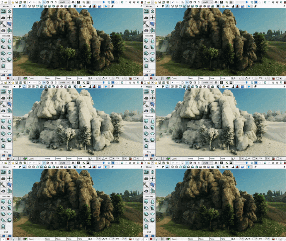
Next up, “Detailed Lighting” view mode. This view mode applies a 50% grey colour on the diffuse on every object, but keeps texture normal map and opacity details and uses that to display the view. This is extremely useful for checking not only how lighting is outputting, but also to see how normal map textures are influencing the lighting. | |||
[[File:Detlightning1.gif|center|488x488px]] | |||
===== Use Cases | =====Use Cases===== | ||
* Check if your light colour and intensity is the correct colour and energy | *Check if your light colour and intensity is the correct colour and energy | ||
* Check to see if the normal maps are displaying correctly | *Check to see if the normal maps are displaying correctly | ||
** Normal maps might be too subtle or too intense | **Normal maps might be too subtle or too intense | ||
** They can also have their Green Channel flipped which will be noticeable | **They can also have their Green Channel flipped which will be noticeable | ||
* Check to see if visually dark spaces are being lit properly or are too dark in diffuse | *Check to see if visually dark spaces are being lit properly or are too dark in diffuse | ||
As an example, take a look at the previous example in the unlit section that you just read through. In there you can see the shadows around the rocks are extremely dark. Naturally you would assume that this is a lighting issue because it’s a shadow. But take a look in the Detailed Lighting or even the Lighting Only view modes to see exactly what the lighting looks like in the shadowed area. As you can see in the GIF above, the shadows are not dark in the detailed lighting view. So we found the culprit to be the diffuse colour being too dark on the material in the Unlit View. This allowed us to fix the extremely dark shadowed areas just by brightening up the diffuse colour on the rock. | As an example, take a look at the previous example in the unlit section that you just read through. In there you can see the shadows around the rocks are extremely dark. Naturally you would assume that this is a lighting issue because it’s a shadow. But take a look in the Detailed Lighting or even the Lighting Only view modes to see exactly what the lighting looks like in the shadowed area. As you can see in the GIF above, the shadows are not dark in the detailed lighting view. So we found the culprit to be the diffuse colour being too dark on the material in the Unlit View. This allowed us to fix the extremely dark shadowed areas just by brightening up the diffuse colour on the rock. | ||
=== Lighting Only === | ===Lighting Only=== | ||
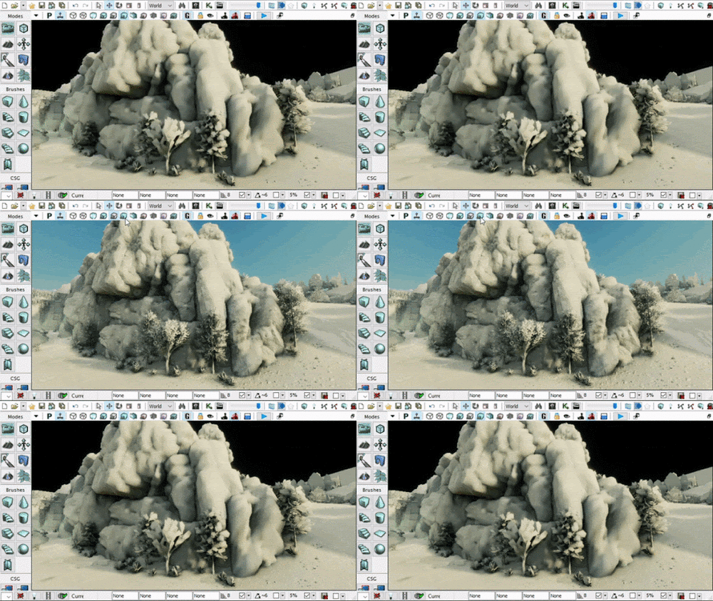
The “Lighting Only” view mode is very similar to the “Detailed Lighting” but this only displays the lighting without any shader effects like normal maps or emissive qualities. This displays the raw lighting results. | |||
[[File:Lightresults.gif|center|500px]] | |||
===== Use Cases | =====Use Cases===== | ||
The use cases for this view mode are mostly identical to the use cases in “Detailed Lighting” view. Both views are also useful in combination to check normal map influences. It's almost like toggling on/off normal maps while cycling between “Detailed Lighting” and “Lighting Only” view modes. | The use cases for this view mode are mostly identical to the use cases in “Detailed Lighting” view. Both views are also useful in combination to check normal map influences. It's almost like toggling on/off normal maps while cycling between “Detailed Lighting” and “Lighting Only” view modes. | ||
==== Light Complexity ==== | ====Light Complexity==== | ||
“Lighting Complexity” is the first of the “Heat Map” style debugging modes. Any object that is light purely with static only lights will appear black. Any dynamic light will display as first green, more dynamic lights will eventually cause the object to display in red. What are dynamic lights? In a level it could be things like moving spot light, or flickering light bulbs. In game play it's things like explosions and muzzle flash lights. | |||
[[File:LightComplex1.gif|center|488x488px]] | |||
The more dynamic lights an object is being influenced by, the more intense the calculations the game engine has to do to be able to render it. Unreal Engine 3 isn’t very good at dynamic objects and lighting. UE3/UDK also has an upper limit to how many dynamic lights one single object can have. | |||
As a mapper, you ideally don’t want any dynamic lights at all. But sometimes you may want to add them for visual reasons. This is “technically” okay to do so long as you keep it to a minimum. Try to limit the radius of that light source to affect as few objects as possible, and try to limit how many dynamic lights an object is influenced by to just 1. This again is not a rule, but rather more of a guideline. | As a mapper, you ideally don’t want any dynamic lights at all. But sometimes you may want to add them for visual reasons. This is “technically” okay to do so long as you keep it to a minimum. Try to limit the radius of that light source to affect as few objects as possible, and try to limit how many dynamic lights an object is influenced by to just 1. This again is not a rule, but rather more of a guideline. | ||
[[File:LightComplex2.gif|center|488x488px]] | |||
Notice how the colours of various objects become more and more red the moment I duplicate a dynamic light. The impact on performance can become exponential and that is why there is a hard limit of just 8 dynamic light influences on a single object. If you’re just making a basic multiplayer map for Renegade X, then your entire map should really just appear completely black. Try to keep it that way :D | |||
The only use case for this view mode is to check the impact of dynamic lights in your level. | The only use case for this view mode is to check the impact of dynamic lights in your level. | ||
==== Texture Density ==== | ====Texture Density==== | ||
The “Texture Density” view mode is displaying the Texal density of the diffuse textures on screen. This doesn’t serve much of a purpose for optimization and performance but is more of a visual guide to see if some areas of the map might not have enough texal density. This view mode also displays information similar to a heat map. However is used more so to aid in visuals then performance. | |||
[[File:TextureDensity.gif|center|488x488px]] | |||
Notice how the texture on that rock has higher texal density when its smaller, and lower texal density when bigger. This is visualizing the 512x512 texture on both a large and small object. That same 512 texture will look more crisp when smaller when you get up close. While looking much more blurry up close if the same object was significantly larger. | |||
====Shader Complexity==== | |||
The “Shader Complexity” is another performance based heat map view mode. Shaders aka Materials can easily become very heavy by having a lot of operations in the material graph. | |||
[[File:ShaderComplex.gif|center|488x488px]] | |||
Now this is one of those tricky and slightly misleading view modes. Unlike things like VRAM for textures, and Physics for CPU; shaders are math operations handled on the GPU’s computation capabilities. I’m sure you’ve heard the term “Teraflops” recently. Shaders have better scalability with modern hardware than hard limits like memory in UE3. HOWEVER! That doesn't mean you can go crazy with shaders everywhere. UE3/UDK is still a DirectX9 renderer and is nowhere near as optimized and capable as DirectX11 and up used in modern game engines. | Now this is one of those tricky and slightly misleading view modes. Unlike things like VRAM for textures, and Physics for CPU; shaders are math operations handled on the GPU’s computation capabilities. I’m sure you’ve heard the term “Teraflops” recently. Shaders have better scalability with modern hardware than hard limits like memory in UE3. HOWEVER! That doesn't mean you can go crazy with shaders everywhere. UE3/UDK is still a DirectX9 renderer and is nowhere near as optimized and capable as DirectX11 and up used in modern game engines. | ||
[[File:Shadercompl123.png|center|800x800px]] | |||
On the left is an example of a very basic material of a simple tiling concrete texture. This will be very easy to process and handle. In the middle is a moderately complex material with vertex position offset used for foliage. This isn't an overly complex shader and the engine can handle this pretty well even with an old GPU like an Nvidia GTX 980. On the right is a shader that’s pushing the limits but is also necessary for allowing a large amount of flexibility and modularity for character materials. This graph even contains toggles to enable/disable entire chunks of the graph based on the needs. As such, it can be both fairly efficient as well as being very heavy based on the needs. Now for hero assets like characters, vehicles and weapons. You normally do want to push them more than you would environmental assets. | |||
So the general rule for map shaders is to keep them as light as possible, however the lowest standards for UDK back in 2011 vs now in 2020 is different. You can push them into the reds, but just don't over do it. If you can get away with sticking to the Greens, then do it! Dont push to the Reds if you don't have to. | |||
=====Overdraw===== | |||
Shader Complexity can also identify another '''critical performance hog called “Overdraw”.''' This refers specifically to meshes with opacity. Things like foliage planes and particle sprites are the biggest culprits of overdraw. Notice how in the gif above, the particle sprites when layered on top of one another become more and more performance heavy in the heat map till they eventually become white. Notice also how the tree in the foreground shows red where it’s see through vs green where there are leaves and branches. | |||
[[File:OverDraw 1.gif|center|488x488px]] | |||
What is Overdraw? This happens when the game engine is '''spending time re-rendering portions of the screen due to transparent objects.''' Rasterized renderers (Game engines) render in layers. All of the opaque objects can be simplified into one layer (it's actually more complex than that but for simple explanation of overdraw lets say its one layer) But now you have added smoke stacks particle effects on some areas of the map.The area on screen where the particles are visible have to be rendered multiple times. I do mean multiple times, as in more than twice. Why? Each sprite in the particle that overlaps another needs to create another layer to render the overlap. This issue can become exponentially worse with high spawn rate particles. | |||
[[File:Overdraw12.png|center|588x588px]] | |||
Opaque materials will not have this issue as there is no need to re-render what’s behind layers. Transparent / opacity masked materials on the other hand do require what’s behind them to be rendered multiple times. Again the more layers of transparency, the more times it needs to re-render. | |||
[[File:Overdraw3.gif|center|488x488px]] | |||
One of the biggest causes of overdraw is the large amount of negative space on the mesh that is completely invisible. In the image below you can see how a smoke texture has a lot of negative space that has zero detail. | |||
[[File:Overdraw4.png|center|488x488px]] | |||
Unfortunately for particle effects there isn't much that can be done to resolve this.Your best for optimizing particles is to keep the sprites as small as possible, and keep their spawn rate as low as possible. '''REMEMBER! Overdraw is exponential on performance'''. The more layers are on top the more exponentially longer the rendering times will become. | Unfortunately for particle effects there isn't much that can be done to resolve this.Your best for optimizing particles is to keep the sprites as small as possible, and keep their spawn rate as low as possible. '''REMEMBER! Overdraw is exponential on performance'''. The more layers are on top the more exponentially longer the rendering times will become. | ||
| Line 179: | Line 201: | ||
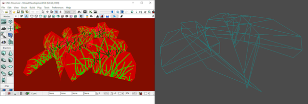
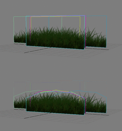
On meshes however we can drastically minimize the effects of overdraw by simply trimming the mesh to be as close as possible to the texture to remove as much negative space as possible. | On meshes however we can drastically minimize the effects of overdraw by simply trimming the mesh to be as close as possible to the texture to remove as much negative space as possible. | ||
<gallery mode="packed-hover" heights="140px"> | |||
File:Overdraw56.png | |||
File:Overdraw7.png | |||
File:Overdraw8.gif | |||
</gallery> | |||
Let's take a look at grass planes as an example. The geometry is adjusted to remove as much of the negative space while still being a very low poly mesh. Notice how compared to the particle sprite gifs above, the grass is only having to do a small amount of overdraw. So when making custom transparent meshes, make sure you keep this in mind. | |||
Overdraw can very quickly and very easily become '''one of the most taxing computations''' that the game engine has to do because it literally means re-rendering parts of the already rendered frame again because of transparent layers on top. So handle this with extreme care. Limit this as much as possible by using smaller and less frequent particle effects, and tighter geometry around alpha textures. | |||
===== Use | =====Use Cases===== | ||
* Material / Shader optimization | *Material / Shader optimization | ||
* Identify overdraw problem spots in your map | *Identify overdraw problem spots in your map | ||
* Both extremely performance heavy elements that should be prioritized! | *Both extremely performance heavy elements that should be prioritized! | ||
==== Light Map Density ==== | ====Light Map Density==== | ||
Next up we have a very important debug view that can help drastically optimize your file size and memory footprint for your maps. '''Finally we’re going to talk about Light maps''' as I mentioned much earlier in this documentation. The “Light Map Density” debug mode is yet another heat map based view mode. Similar to the Texture Density view mode, this view mode will highlight the texal density of light maps on all of your objects. | |||
[[File:LMdensity.png|center|820x820px]] | |||
=====What are Light Maps?===== | |||
UDK / UE3 is not particularly great at handling dynamic lights especially with larger objects that you would see in cases of level assets and environments. So the game engine can pre-calculate the effects of lights onto a texture that can be applied on to each object individually. '''Imagine if all of the light and shadows on a rock were captured on a texture''' based on the Rock’s UVs, and then applied onto the object’s emissive channel while the object itself is not being lit up at all by any light source. | |||
[[File:Lmaps1.png|center|488x488px]] | |||
The image above is a quick example of how this works. This cube is technically not receiving any lights, but rather the light and shadows are painted onto a texture which is applied directly to that object. The higher the resolution of the light map texture, the more crisp and detailed the shadows and lighting results will appear, as shown in the image below | |||
[[File:Lmaps2.png|center|540x540px]] | |||
I hope you are still keeping the texture video memory description in mind because this is where it matters a lot. Because light maps are textures, they are fed directly into video memory. Which means you cannot create high resolution light maps without consequence, and '''the consequence is the infamous “Ran out of video memory” crash'''. Also because they are textures, your file sizes will become bloated very very quickly if you’re not careful. | |||
[[File:Lmaps3.png|center|820x820px]] | |||
'''Light maps resolutions should always be set to a resolution of “Power of 2”'''. For the reason explained above regarding video memory. You must always make sure that the '''“Light Map Resolution”''' values in your static mesh are always set to a value of a power of 2 in order to maximize memory usage, and minimize any waste. You should also '''use the secondary UV channel for lightmaps''' (Default is channel 0 which is used for material textures). The '''“Light Map Coordinate Index”''' value can select any secondary UV channel your mesh may have. | |||
=====How to optimize Light Maps===== | |||
[[File:Lmaps4.png|center|488x488px]] | |||
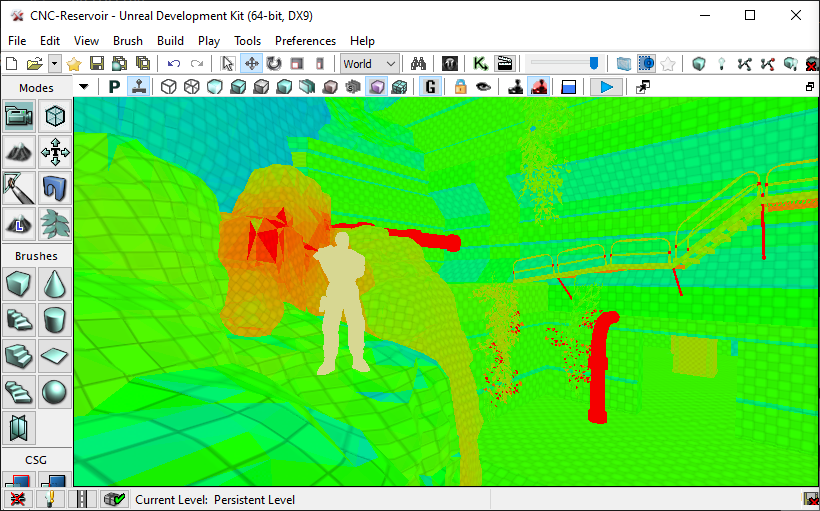
Light map density mode will display a heat map ranging from blue (very optimal), all the way to red (very expensive). On top of that this view mode also displays objects that do not have any light maps as a faded beige colour as seen in the image above. This is caused by the static object not having any UVs setup for light maps. | |||
[[File:LightMapDensity5.gif|center|488x488px]] | |||
Let's take a look at the same mesh in the static mesh viewer. This mesh is set to use a different UV channel for light maps as displayed by the “Light Map Coordinate Index” value being set to 1. But when we display UVs for “UV Channel 1”, it doesn't show any UVs. This is because this mesh is not set up to have any secondary UV channel. | |||
This does not however mean that it won't use static lighting. If this is the case, then this mesh will instead use vertex colour to bake in lighting. What are vertex colours? This is a colour value applied to every vertice on the object to substitute in for the lack of a light map. | |||
[[File:Lmaps6.png|center|488x488px]] | |||
Notice how there is a colour value applied to each vertex and blends to the adjacent vertex. However the quality is always going to match the mesh’s geometry density. The denser the mesh is, the better the results will look. Vertex colours can also become pretty expensive if you go overboard with the amount of meshes and how dense they are. However if they are few and far between and a relatively low resolution mesh. Then they won't have much of an impact and are safe to use. | |||
[[File:Lmaps7.png|center|488x488px]] | |||
Now lets get back to light maps. Notice how every object that has Light map UVs '''display a checker pattern'''. This is visualizing “texal density” Which means how many pixels are in that light map texture in proportion to the object size. '''Each checker square = 1 pixel.''' | |||
[[File:Lmaps8.png|center|488x488px]] | |||
For light maps you’ll want to stay in the Blues as that ensures that you are using as small of a resolution for light maps as possible. You might think that having light maps have pixels that large will look bad, but you would be surprised as to how small you can go without much of a visual impact. | |||
Let's take a look at a prime example of optimized light maps. Field X: | Let's take a look at a prime example of optimized light maps. Field X: | ||
[[File:LightMapDensity8.gif|center|488x488px]] | |||
'''Almost the entire map is in Blue, yet it still looks well lit with zero lighting artifacts'''. Don’t under-estimate how low you can go with light map resolutions. Even in this case some of the few green and even a few red objects can be scaled down to be in the blue range. Now this map runs as smooth as butter on most low end computers, and '''has never been known to have the “Ran out of Video Memory” crash'''. This map is only 137mb in file size well within the optimal file size for Renegade X maps. | |||
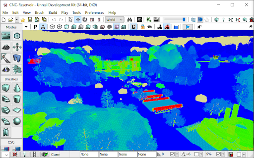
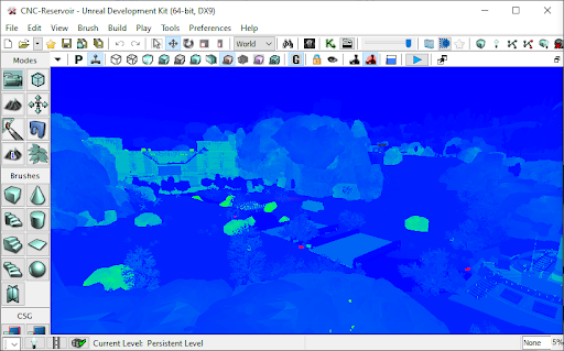
Let's look at another example “CNC-Reservoir”. Before (Left) it was 202mb, and now after (Right) with light map optimization it has had zero changes visually while dropping down to 141mb in file size. | |||
<gallery mode="packed-hover" heights="240px"> | |||
File:Lmaps9.png | |||
File:Lmaps10.png | |||
</gallery> | |||
===== The Perfect Light Map ===== | =====The Perfect Light Map===== | ||
Let's discuss '''how to set up the perfect light map''' that follows all of the rules of a light map. This will help us to identify one critical issue with “The Perfect Light Map” and '''why it's not always a good thing'''. | |||
Rules of light maps in UDK: | Rules of light maps in UDK: | ||
# No Overlapping UVs (This must always be true) | #No Overlapping UVs (This must always be true) | ||
# Must have 2 pixel buffer between UV shells (Mostly True) | #Must have 2 pixel buffer between UV shells (Mostly True) | ||
# UV Vertex proportionally snapped to the light map resolution’s pixel grid (Good practice) | #UV Vertex proportionally snapped to the light map resolution’s pixel grid (Good practice) | ||
# UV shells are not distorted or disproportionately scaled (Very Dangerous) | #UV shells are not distorted or disproportionately scaled (Very Dangerous) | ||
<hr /> | |||
*No Overlapping UVs. This means that every part of the mesh must be separated in the UVs otherwise you will have duplicating artifacts in your light maps as two different parts of the same object can be in different lighting conditions producing different results. This means you could end up having shadows from one overlapping section being projected onto the other overlapping section. So this rule must always be true. You must never overlap any UVs. Notice how the image below shows every part of the mesh separated with absolutely no overlapping. | |||
[[File:PerfLmap1.png|center|488x488px]] | |||
*Must have 2 pixel Buffer between UV Shells. Let's take a closer look and examine the UVs on this same object. In the image below, notice how all UV shells have 2 grid square spacing in between. The goal for this mesh is to use a light map resolution of 256. So therefore the grid displayed is matching the resolution by having 256x256 grid lines to identify spacing. | |||
[[File:PerfLmap2.png|center|488x488px]] | |||
*Must snap UV Vertex proportionally to the light map resolution’s pixel grid. As mentioned the grid is set up to match 256x256. All UV shells and their vertices are snapped perfectly to every grid. This is only really possible on mostly flat 90 degree shaped objects. It would be very challenging to do this on an organic shape like a rock. | |||
Now let's take a look at this object in UDK. We’ve set up this object to match the resolution with 256, and are using the correct UV channel. This will produce “Perfect” light maps because it follows all of the rules precisely. | |||
<br /> | |||
[[File:PerfLmap3.png|center|488x488px]] | |||
<br /> | |||
*UV shells are not distorted or disproportionately scaled. This is true for this mesh. What this means is that every part of the UV is perfectly scaled to keep consistent texal density throughout along with absolutely no distortions what so ever. Meaning if that checker pattern was overlayed, it would look flawless. This is mostly possible due to the light map resolution being set to 256x256 to allow us to have enough room to perfectly fit UVs with zero distortion and disproportionate scaling. | |||
[[File:PerfLmap4.png|center|488x488px]] | |||
But this can be very very dangerous from an optimization perspective. Lets jump into the editor and see what this looks like, and '''why this is a really really bad idea.''' | |||
<br /> | |||
[[File:Docs Mapping DebugViews LightMapDensity 3.gif|center]] | |||
As we switch to light map density view, you can see exactly what the issue is. Under “perfect” light map set up rules, the performance can take a major hit. This is just a 256x256 resolution light map, and yet even in this screenshot it’s hard to make out that checker pattern. Texal density is very important to manage for video memory performance. One solution you could try (But work work well) is to reduce the light map resolution down to blue. Lets see what that looks like: | |||
[[File:Docs Mapping DebugViews LightMapDensity 4.gif|center]] | |||
Ugh… Not so great. Lost a lot of detail. Why does it look so bad at 16x16? Well for one it’s significantly lower resolution. You will have to compromise visual fidelity when reducing light map resolutions. You will never be able to keep the same results with lowest resolutions. You will have to accept that stability and performance outweighs visual fidelity. | Ugh… Not so great. Lost a lot of detail. Why does it look so bad at 16x16? Well for one it’s significantly lower resolution. You will have to compromise visual fidelity when reducing light map resolutions. You will never be able to keep the same results with lowest resolutions. You will have to accept that stability and performance outweighs visual fidelity. | ||
===== The Not So Perfect Light Map ===== | =====The Not So Perfect Light Map===== | ||
You can still however improve the quality of the low resolution light map UVs by not following the light map rules to the letter. Focus on large high visibility areas. You can also distort and manipulate your UVs to not follow the grid snapping rules within reason. You will have to find the right balance yourself. Let's take a look at the distorted UVs of this same mesh to support 16x16 light map resolution. | |||
<br /> | |||
[[File:PerfLmap5.png|center|thumb|489x489px]] | |||
By no means is this clean, and it makes me cringe. But it's something that I know I have to live with. Now lets compare the results inside UDK. | |||
<br /> | |||
[[File:Docs Mapping DebugViews LightMapDensity 5.gif|center]] | |||
<br /> | |||
[[File:PerfLmap6.png|center|588x588px]] | |||
By manipulating the sizes of the UV shells to better support the larger more visible faces, I managed to also get the important larger sections of the mesh in the green range. While still having an ultra low resolution light map for a moderately sized object. | |||
This example is also a worse case scenario where the shape is very linear with perfect straight angles. In the case of most Renegade X maps, you will likely be running into mostly elements like rocks, foliage, and mostly naturally shaped objects. These types of objects are a lot more forgiving to reduce light map resolutions. Lets take a look at a mesh I’m sure we’re all very familiar with: | |||
<br /> | |||
[[File:Docs Mapping DebugViews LightMapDensity 6.gif|center]] | |||
So the lesson is go as low as you can before you start to look wrong/broken. Do your best to get to the Blue range in the Light Map Density view mode. '''Definitely avoid any orange or reds.''' '''Blue to Green is your optimal range.''' | |||
==== Lighting Only with Texal Density ==== | ====Lighting Only with Texal Density==== | ||
I won't go over the “Lighting Only with Texal Density” view mode as its basically just the same as the “Light Map density” view mode but instead of a heat map as a measure, it uses the “Lighting Only” view mode as a display. It also adds the checkerboard texture to visualize the light map resolution. I find the “Light Map Density” view mode to be far more beneficial. | |||
[[File:Texal1png.png|center|588x588px]] | |||
This covers all of the view modes that you need to become familiar with in UDK for optimizing your maps in Renegade X. Remember that they can help you debug everything from performance and optimization, all the way to visual quality improvement. This is a powerful tool set, use it! | |||
===Foliage Optimization=== | |||
<br /> | |||
[[File:Foliage1.png|center]] | |||
Managing your foliage is very important for video memory. The Foliage tool will merge a cluster of foliage into a single object and hence also a single light map. It will do this by combining the light maps of individual foliage instances into one larger light map texture. By default the foliage tool is set to cluster 100 instances. But this poses a problem. Lets do some simple math. | Managing your foliage is very important for video memory. The Foliage tool will merge a cluster of foliage into a single object and hence also a single light map. It will do this by combining the light maps of individual foliage instances into one larger light map texture. By default the foliage tool is set to cluster 100 instances. But this poses a problem. Lets do some simple math. | ||
* Grass Mesh light map resolution = 8 by 8 | *Grass Mesh light map resolution = 8 by 8 | ||
* 100 instances of grass mesh will create a light map texture = 800 by 800 | *100 instances of grass mesh will create a light map texture = 800 by 800 | ||
* 800 pixels is not a power of 2 | *800 pixels is not a power of 2 | ||
* Therefore this will waste video memory space since it will need to place an 800 x 800 light map into a 1024 x 1024 memory block texture | *Therefore this will waste video memory space since it will need to place an 800 x 800 light map into a 1024 x 1024 memory block texture | ||
How do you solve this? Set the number of cluster instances to a power of 2. For example instead of 100 clusters, the cluster group can be set to 64. 8 times 64 = 512. Therefore our lightmap for the 64 cluster is 512 x 512 and thus fits perfectly into video memory. | How do you solve this? Set the number of cluster instances to a power of 2. For example instead of 100 clusters, the cluster group can be set to 64. 8 times 64 = 512. Therefore our lightmap for the 64 cluster is 512 x 512 and thus fits perfectly into video memory. | ||
In the foliage tool, select the 3rd button on the top left in with the icon that looks like the letter “ i “. This will open up cluster settings. Here you can define how many instances to have in a cluster group. You can also define culling distances which is very important for keeping the number of actors drawn on screen to be as low as possible | |||
[[File:Foliage2.png|center]] | |||
. | |||
[[File:Foliage3.gif|center]] | |||
You are also able to define detail level visibility in the same menu. You can set certain foliage to be hidden at high and medium settings by defining their “Detail Mode” to High, Medium, or Low. This is great for making the map less heavy for people who have to set their graphics settings to low. | |||
=== Precomputed Visibility === | ===Precomputed Visibility=== | ||
What is precomputed visibility? This is a substitute for bounding box / distance based culling. Culling is to remove/hide objects that are far away in the distance or hidden behind other objects. Dynamic Culling is the engine’s default. Although not necessarily bad for performance, it can become taxing if there are a lot of objects in your scene. To mitigate the need to process every object on every frame, UDK has a pre-calculated system similar to how light maps are pre-calculating lighting. | |||
<br /> | |||
[[File:PCvis1.png|center]] | |||
In this case however we can pre-calculate which objects to cull when in various locations in a map. This is done by first enabling “Precomputed Visibility” in your level’s world properties. What this will do is create metadata that stores whether to hide or display every object based on the camera’s position in the level. | |||
The system once enabled will create a grid of cells. These cells are small cube shaped volumes that are sitting on the level geometry. The size of these cells are defined in the world properties settings as “Visibility Cell Size”. The smaller the cells the more cells the engine will have to generate. The larger the cell the fewer it will need to generate. Both have their pros and cons. “Visibility Aggressiveness” defines how harsh the culling will be. This acts as a buffer if very low, and at high can be less forgiving to objects that are just within the visible range. | |||
There are a lot of pros and cons to this system. On the one hand it’s able to clear up a large number of computations that happen in real time on every frame to determine whether to hide or display an object. However this system also creates an abundance of metadata that all gets saved in your map’s file. '''If mishandled, this will DRASTICALLY bloat your map’s file size'''. As you all know by now, that’s bad. | |||
Precomputed Visibility is managed via the “Precomputed Visibility Volumes”. These are volumes you can place in the scene to dictate where the cells will be generated. '''DO NOT PLACE A GIANT VOLUME THAT COVERS THE WHOLE MAP!''' Okay now that that’s clear, it's important to reduce the number of these cells that will get generated. The last thing we want to do is overburden the engine by having to load a tonne of metadata as a trade off of reducing realtime culling calls. You should only place localized small volumes in areas of the map where there will be more traffic. Let's take a look at Field X again. | |||
<br /> | |||
[[File:Docs Mapping PreCompVis 1.gif|center]] | |||
Notice how there are smaller volumes localized to each area of the map. For example the GDI Base, Nod Base, Field, Tunnels, etc.. Try to keep these volumes to a minimum as we dont want to tax the game engine to have to load a lot of metadata for culling. | |||
General guideline: | General guideline: | ||
* Create smaller volumes that encompass localized areas of the map | *Create smaller volumes that encompass localized areas of the map | ||
* Do not go below 400 units for cell size | *Do not go below 400 units for cell size | ||
* Do not create one large volume that encompasses the entire map | *Do not create one large volume that encompasses the entire map | ||
* Do not worry about covering every part of the gameplay space in your map | *Do not worry about covering every part of the gameplay space in your map | ||
=== Draw Calls === | ===Draw Calls=== | ||
What are Draw Calls? Where do I begin… It's complicated. This falls under the rasterized renderer which is how video game engines make pretty pictures as final frames. A draw call is a series of processes on the CPU which is then sent over to the GPU to render them on a per pixel level. So for example 5 rocks meshes will be processed in 5 Draw Calls. | |||
Now let's say we have a Renegade X building asset. Technically still a single static mesh, but contains a tonne of different materials for different tiling textures. This one build mesh for example could have 10 materials. Because there are 10 materials, each material needs to be handled in a separate draw call on the entire mesh. So this same mesh is now going to have to go through 10 separate draw calls to process each material individually on that one static mesh. This ends up becoming a heavy load for both the CPU and GPU. | Now let's say we have a Renegade X building asset. Technically still a single static mesh, but contains a tonne of different materials for different tiling textures. This one build mesh for example could have 10 materials. Because there are 10 materials, each material needs to be handled in a separate draw call on the entire mesh. So this same mesh is now going to have to go through 10 separate draw calls to process each material individually on that one static mesh. This ends up becoming a heavy load for both the CPU and GPU. | ||
<br /> | |||
[[File:Drawcalls1.png|center]] | |||
Let's take a look at the GDI Barracks. It contains 17 different materials. This means this mesh has to go through the CPU and GPU 17 times to be able to render correctly. In case it wasn’t obvious. That’s bad. | |||
What does this mean for making maps? For making a map itself it means you need to not only have fewer meshes (actors) in the scene, but those meshes also need to have the fewest possible number of materials. Unfortunately there is no debug view for this so this is a bit of a manual process in UDK. It's more so up to you as you develop your map. Keep an eye out for how many different meshes exist in the level, as well as how many materials each mesh has. | |||
Now this image has a guideline for the number draw calls for a PC/Console game. However these numbers are also based on modern game engines. Divide this number by 2 and it's more or less what the limits for UDK are. Every mesh in your map is added to draw calls. So it's best to keep the number of different static meshes to a minimum. As well as their materials down to as few as possible. Because they can multiply and get out of control very quickly. | |||
<br /> | |||
[[File:Drawcalls2.png|center]] | |||
So managing the amount of objects in your level is very important! If you don't, your CPU will have a heart attack and the game will slow down and potentially even crash. We wouldn’t want that now would we! | |||
==Conclusion== | |||
Now that you understand a little more about theory and practice about how performance plays a role and how to manage it properly. You should now be able to optimize your maps in a way that should make them extremely stable and also allow for high frame rates. Feel free to google more about individual topics as that will drastically help you get a lot more information on specifics. | |||
[[File:Drnikfinal.gif|center]] | |||
<br /> | |||
{{Renegade X}} | |||
[[Category:Development]] | |||
Latest revision as of 14:09, 31 January 2021
Renegade X - Technical Guidelines
A comprehensive guide to efficient and optimized maps for RenX

Introduction

Welcome to a guideline for Renegade X and UDK map creation. This documentation is intended to very roughly cover problem areas that most hobbyists will likely miss. These are common mistakes and issues that non game developers face when trying to mod any game. Game engines are a technical marvel, and a lot of insanely smart people somehow make magic happen and create tech that can make entire worlds come alive in real-time.
A lot of very technical solutions are employed inorder to make that possible. Most of these are things modders will never have to worry about. However the more you are aware, the better off you’ll be. No one is expecting you to know everything so you shouldn’t feel bad about not knowing something basic. Even professional developers are oftentimes unsure about how it all works sometimes.
I have an artist background with almost a decade of professional experience and am coming at this from a more end-user side of things. While I am somewhat adept at the technical side of things; a lot of it is still alien to me. Because I am an artist, I am a visual learner; I follow the “Picture is worth a thousand words” motto. But why only stick to static images when they can be moving. A picture may be worth a thousand words, but a gif is worth a million.
What does this cover? I will be covering basic principles in both the technical and artistic side of game development and more specifically map/level creation. I have also created categories so that you can jump between different topics by following the document outline on the left side of Google Docs. For those of you who are interested in taking a deeper dive into UDK, then I highly recommend you go through the official documentation.
Technical Guidelines and Practices
Overview
Most hobbyists will approach level creation from a purely visual standpoint. It's easy to assume that level creation is really just about smashing objects together, adding in lights and particles and calling it done. It can become very easy to get carried away with a purely visual sense as it feels very natural. However game engines are all about efficiency. But don’t worry about not getting it right away, even professionals get it wrong sometimes. So don’t be nervous and don’t skip this section!
From a professional standpoint, every map is optimized to squeeze out as many frames as possible. This can mean anything from using fewer objects, to deep diving into profilers that scan and graph out exactly what every part of your game is doing on every component of your computer. I won't be covering any profilers in this documentation as that isn’t an area most hobby modders and mappers are interested in. Now let's get started!
Performance and Optimization
You’ve made a cool looking map and are excited to play. You hit play but… you’re only getting 20 frames per second… WHAT!? Performance and optimization is a critical part of map creation. Sometimes it means compromising on your visuals, but more often than not; it’s more about how low you can go before anyone starts to notice.
First thing to note is UDK is an outdated engine in 2021. Unreal Engine 3 first made it’s production release game debut in 2006. It has been updated significantly since it’s humble beginnings, and the UDK specifically was roughly completed by around 2011 with minor hotfixes till 2015.
What this means is that the UDK (aka Unreal Engine 3) is a very out-dated game engine that is not going to be able to take full advantage of any modern beastly hardware. The game engine was also made to support Xbox 360 and PlayStation 3. This is a game engine from yester-year and will need to be handled in a more delicate manner.
As an example, you probably have seen the “Ran out of video memory” crash bug in Renegade X especially with the 32bit client. UDK also doesn’t fully utilize 64bit since at the time it was still a pretty new thing 10 years ago. So optimizing maps for Renegade X is absolutely critical!
Memory Usage and Size Management
Understanding Video Memory for Textures
I’ll be honest here… I dont understand it either, and I’m definitely not qualified to be talking about it. However I’m going to explain it the way one of my professors did. An easy to digest visual aid that made “sense” kinda... Granted this was explained to me 12+ years ago so things may be very different now. If you know more about this topic, then please correct me.
Video Memory or VRAM as it’s known kinda looks like this:
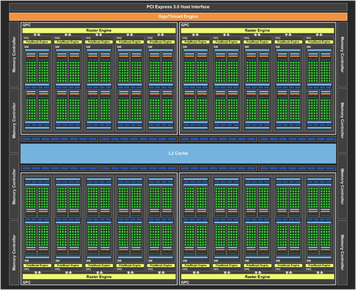
Memory management in game engines can be explained as a series of really large empty square textures. There are MANY of these really large and empty textures. The more of these you have the larger your hardware’s memory capacity is.
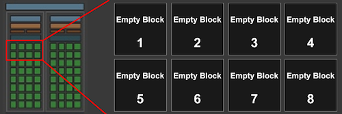
Game textures are stored in these large empty textures and assembled like a jigsaw puzzle, except it's all in the shape of squares and rectangles. Game engine tries to fit as many game textures as possible within each block.
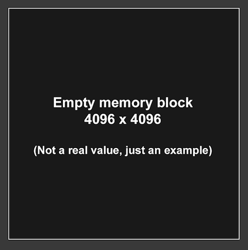
However sometimes memory can have empty space left over if there simply isn't a texture that is the correct dimensions to be able to fit within that empty space. So memory can go to waste if mishandled.
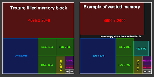
In the above image, the square on the right shows textures that are not a power of 2 (256, 512, 1024, etc..) but rather arbitrary sizes. This can end up not filling up the entire available room on that memory block. As a result part of the memory’s capacity will go to waste. This is why it's always important to follow power of 2 sizes in your textures and in your light map resolutions.
Now imagine all of these blocks essentially acting as a file size of a full sized texture that fits in that block. Multiply that by the number of blocks, and that is how you get the capacity on your GPU’s video memory. So for example 4GB of VRAM equals some massive number of empty texture blocks.
But why does this matter you might ask, UDK can only import power of 2 textures anyways. Yes this is true, UDK can only import power of 2 textures, however there are other “texture types” that aren’t restricted to this rule. LIGHT MAPS! I’ll be going over this a little further down in this documentation under debug views. For now keep this idea in the back of your head. But first let’s cover a major issue mappers face in Renegade X that’s related to video memory.
The Problem
One of the biggest reasons to see the “Ran out of video memory” issue in RenX is due to the amount of data that needs to be loaded in memory. Video memory aka VRAM is your graphics card memory. As I mentioned this is a game engine designed to operate on older graphics cards with far fewer video memory. I don't know the exact vram limit but based on GPUs from 10 years ago plus the Xbox360, and PS3 consoles; I suspect it is restricted to a maximum of 4GB of video memory. Even if your current graphics card is a whopping 24gb, the game engine doesn't support it.
Textures are the most common type of data that is read on VRAM. You will have to be very careful with how many assets and textures are visible on screen. The more you have the more space your map will take up in your VRAM. Every texture type will be considered, from simple colour/diffuse all the way to per mesh lightmap textures. All textures also use various different types of texture compression depending on the type of texture which will shrink their memory footprint.
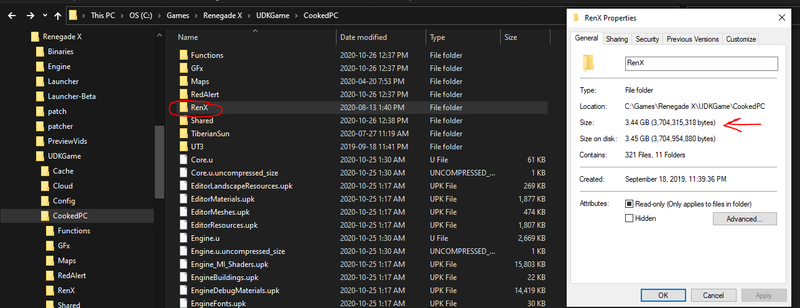
Every gameplay asset (assets that are not tied to any map but rather are always loaded) such as characters, vehicles, and weapons will already eat up a sizable amount of video memory since those assets are always loaded and required for you to be able to play the game. This means you have less than the 4GB of vram that the engine is limited to for your map. All of this data has to be loaded which means your map doesn’t have a lot of room left to fit into video memory.
The Solution
RenX gameplay assets alone take up roughly 3.5gb of space. Again not all of this goes directly into VRAM and there are other factors, but with some simple math, it means we’re left with roughly 0.5gb of space left. Divide that by 2 to factor in non-renx specific assets and elements needed to be loaded plus a little bit of a buffer, and you’re left with around 250mb.
File size can be a very easy way to help translate this information. Do not rely on it completely as there are many other factors involved, but keeping your map file size and any complimentary UPK package files as small as possible will be your best method of preventing the video memory crash from taking place.
So a simple rule to follow for renx maps is that map files + any associated UPK file should be less than 200mb in file size. This is not a sure thing as some maps have functioned correctly while being larger in size, but are known to sometimes cause the video ram issue. Try to keep your map file less than 160mb, and any supporting upk to less than 20mb.
Ways to reduce and optimize file size
- Reduce Light map resolution on static meshes
- Use the light map texal density view to see which objects can be reduced
- Static shadows don't need to be super sharp. They can be blotchy and blurry
- Reduce number of unique textures and meshes loaded in the map
- The more unique assets are loaded, the more unique textures will be as well
- Reuse as many of the same objects as you can to reduce number of textures
- Reduce complexity in precomputed visibility volumes
- Do not have microscopic cell sizes with large volumes
- Do not create a giant single volume
- Create smaller pockets in gameplay spaces
- Clean out unused data from map and supporting upks
- If there are any elements in your map or upk that aren’t used, delete them
Debugging Views - Your new best friend
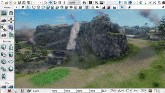
What are debugging views? Well they are helpful for displaying certain types of information that are all necessary to render the final image. Some views go even further than that and are able to display performance and optimization specific information relayed through a “Heat Map”. Blue = Cold = Nice and chill! While the colour Red = On Fire = Will melt your PC!
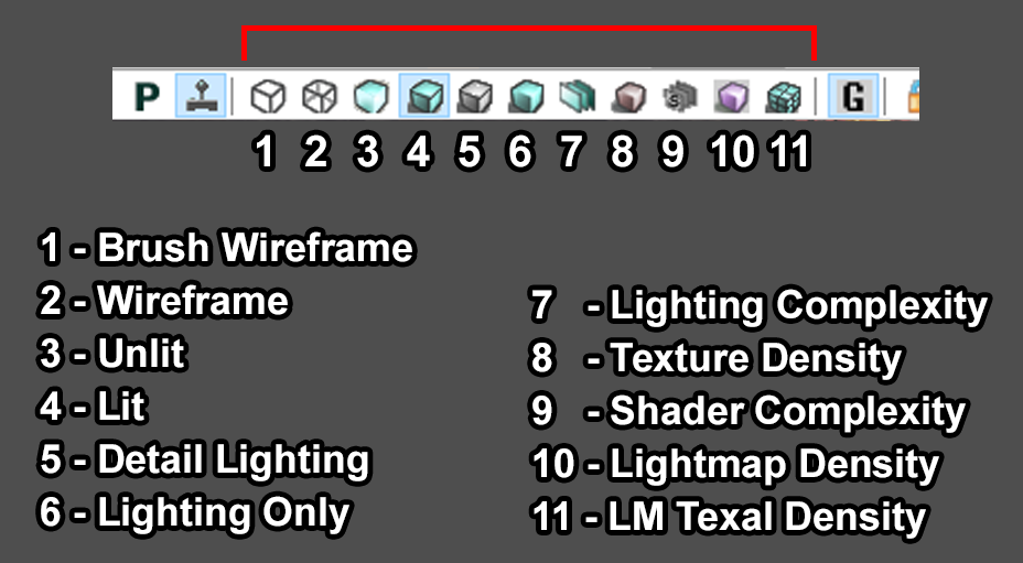
Lets go over 9 standard view modes (excluding wireframe). Some are more useful for debugging visual elements and artifacts, while others are designed specifically for displaying what is hogging performance and reducing frame rates. You can find the buttons on the top of your viewport that look like a cube displayed to resemble the way you would see a cube in that view mode.
Lit
The standard display is the “Lit” mode. This is the same as what you’ll see as the final render ingame. What you see is what you get. This is the end result of various different view modes layered on top of one another to produce this output. Not much to say about this view excpt, this is what you’ll likely be using almost all of the time when making the map.
Unlit
The next view to cover is the “Unlit” view. This is the opposite of the Lit view. It removes all of the lighting in the scene so that you’re only seeing the diffuse colours plus emissive objects along with any post process effects.
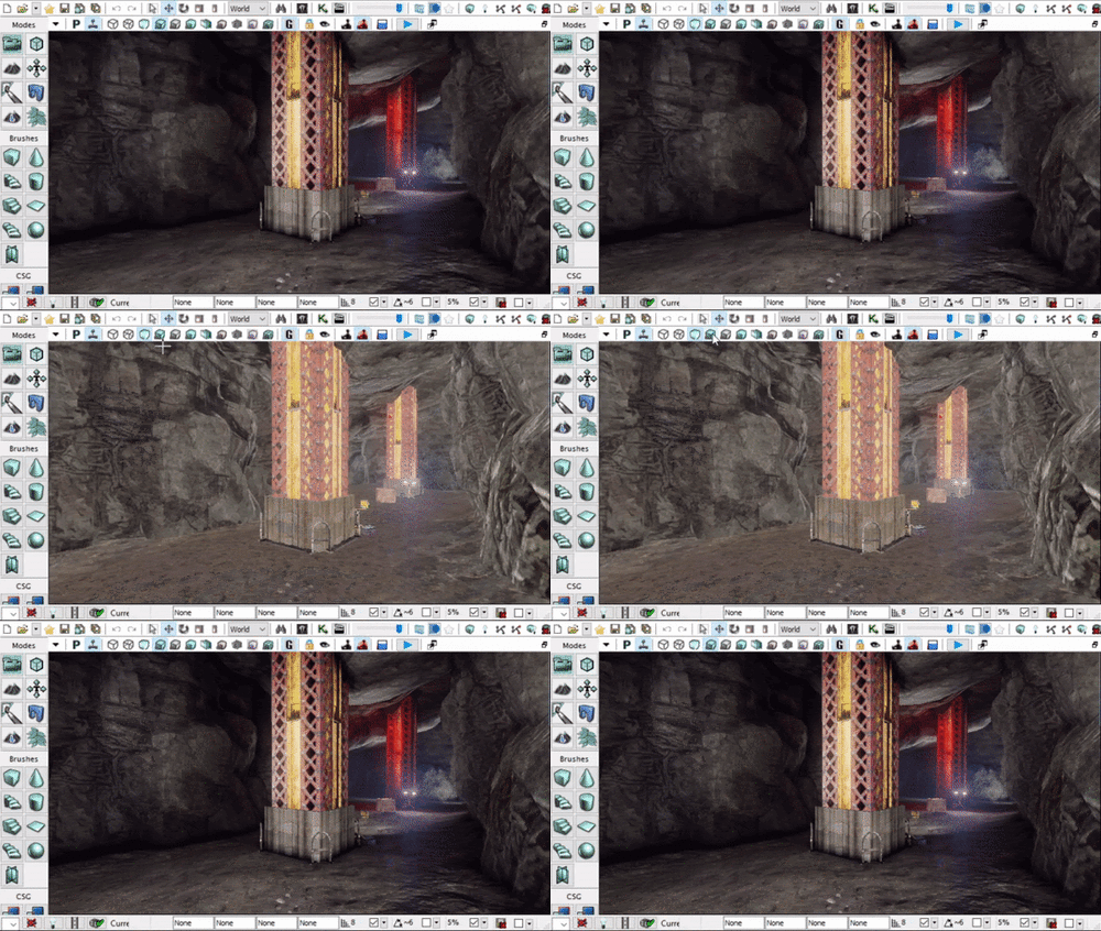
This is one of the most useful display modes for creative purposes. Managing colour palette, and colour ranges is especially useful. If something looks like it's standing out for some odd reason in standard Lit view, check your unlit view to see how the brightness of that object compares to everything around it. This can help you to reign in any materials that are misbehaving.
Use Cases
- Compare texture values to make sure nothing stands out as looking “wrong”
- Be able to see fake lighting effects like Fresnel, and top light without lighting results on top
- Creative uses in balancing colours on all of your objects in the scene
- Debug whether there is a lighting or material issue on objects that dont look right
An example of debugging certain visual issues
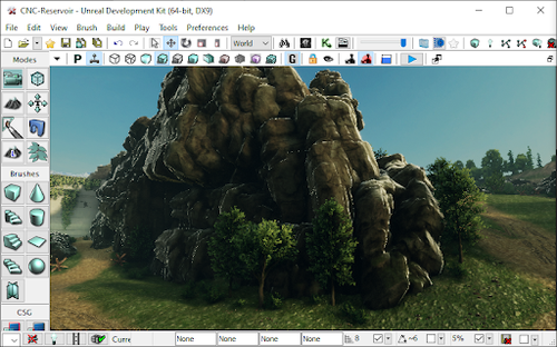
The rocks in this screenshot appeared to have very bright edge light that almost looked like specular. The gut reaction may be to turn down the specularity on the material. But before you do that check both your unlit and detailed lighting view as that can very quickly highlight what the issue is. Now let's take a look at this in the unlit view and see what happens
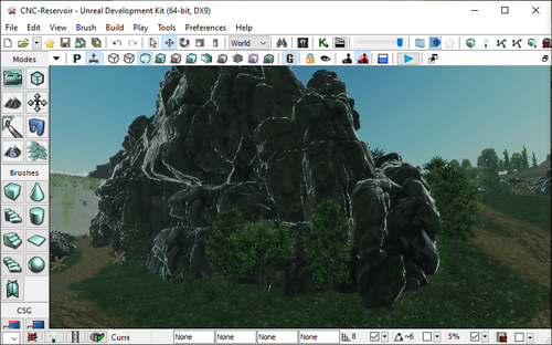
.
Woah! Yup this is because of fresnel faking rim lighting in the material. Now that we know what the issue is, we can quickly resolve it in the material. After adjusting the material by reducing the fresnel and brightening up the base diffuse value, it now looks much better and more natural.

Do not underestimate the usefulness of this view mode. Especially when it comes to creative debugging.
Detail Lighting
Next up, “Detailed Lighting” view mode. This view mode applies a 50% grey colour on the diffuse on every object, but keeps texture normal map and opacity details and uses that to display the view. This is extremely useful for checking not only how lighting is outputting, but also to see how normal map textures are influencing the lighting.
Use Cases
- Check if your light colour and intensity is the correct colour and energy
- Check to see if the normal maps are displaying correctly
- Normal maps might be too subtle or too intense
- They can also have their Green Channel flipped which will be noticeable
- Check to see if visually dark spaces are being lit properly or are too dark in diffuse
As an example, take a look at the previous example in the unlit section that you just read through. In there you can see the shadows around the rocks are extremely dark. Naturally you would assume that this is a lighting issue because it’s a shadow. But take a look in the Detailed Lighting or even the Lighting Only view modes to see exactly what the lighting looks like in the shadowed area. As you can see in the GIF above, the shadows are not dark in the detailed lighting view. So we found the culprit to be the diffuse colour being too dark on the material in the Unlit View. This allowed us to fix the extremely dark shadowed areas just by brightening up the diffuse colour on the rock.
Lighting Only
The “Lighting Only” view mode is very similar to the “Detailed Lighting” but this only displays the lighting without any shader effects like normal maps or emissive qualities. This displays the raw lighting results.
Use Cases
The use cases for this view mode are mostly identical to the use cases in “Detailed Lighting” view. Both views are also useful in combination to check normal map influences. It's almost like toggling on/off normal maps while cycling between “Detailed Lighting” and “Lighting Only” view modes.
Light Complexity
“Lighting Complexity” is the first of the “Heat Map” style debugging modes. Any object that is light purely with static only lights will appear black. Any dynamic light will display as first green, more dynamic lights will eventually cause the object to display in red. What are dynamic lights? In a level it could be things like moving spot light, or flickering light bulbs. In game play it's things like explosions and muzzle flash lights.
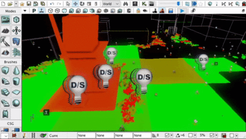
The more dynamic lights an object is being influenced by, the more intense the calculations the game engine has to do to be able to render it. Unreal Engine 3 isn’t very good at dynamic objects and lighting. UE3/UDK also has an upper limit to how many dynamic lights one single object can have.
As a mapper, you ideally don’t want any dynamic lights at all. But sometimes you may want to add them for visual reasons. This is “technically” okay to do so long as you keep it to a minimum. Try to limit the radius of that light source to affect as few objects as possible, and try to limit how many dynamic lights an object is influenced by to just 1. This again is not a rule, but rather more of a guideline.
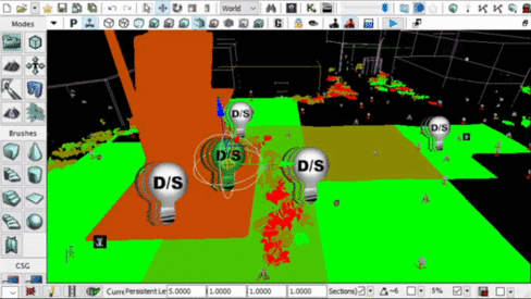
Notice how the colours of various objects become more and more red the moment I duplicate a dynamic light. The impact on performance can become exponential and that is why there is a hard limit of just 8 dynamic light influences on a single object. If you’re just making a basic multiplayer map for Renegade X, then your entire map should really just appear completely black. Try to keep it that way :D
The only use case for this view mode is to check the impact of dynamic lights in your level.
Texture Density
The “Texture Density” view mode is displaying the Texal density of the diffuse textures on screen. This doesn’t serve much of a purpose for optimization and performance but is more of a visual guide to see if some areas of the map might not have enough texal density. This view mode also displays information similar to a heat map. However is used more so to aid in visuals then performance.
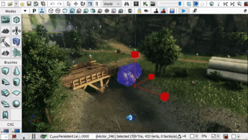
Notice how the texture on that rock has higher texal density when its smaller, and lower texal density when bigger. This is visualizing the 512x512 texture on both a large and small object. That same 512 texture will look more crisp when smaller when you get up close. While looking much more blurry up close if the same object was significantly larger.
Shader Complexity
The “Shader Complexity” is another performance based heat map view mode. Shaders aka Materials can easily become very heavy by having a lot of operations in the material graph.
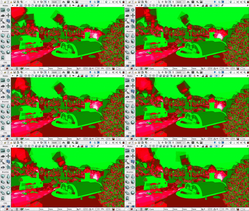
Now this is one of those tricky and slightly misleading view modes. Unlike things like VRAM for textures, and Physics for CPU; shaders are math operations handled on the GPU’s computation capabilities. I’m sure you’ve heard the term “Teraflops” recently. Shaders have better scalability with modern hardware than hard limits like memory in UE3. HOWEVER! That doesn't mean you can go crazy with shaders everywhere. UE3/UDK is still a DirectX9 renderer and is nowhere near as optimized and capable as DirectX11 and up used in modern game engines.

On the left is an example of a very basic material of a simple tiling concrete texture. This will be very easy to process and handle. In the middle is a moderately complex material with vertex position offset used for foliage. This isn't an overly complex shader and the engine can handle this pretty well even with an old GPU like an Nvidia GTX 980. On the right is a shader that’s pushing the limits but is also necessary for allowing a large amount of flexibility and modularity for character materials. This graph even contains toggles to enable/disable entire chunks of the graph based on the needs. As such, it can be both fairly efficient as well as being very heavy based on the needs. Now for hero assets like characters, vehicles and weapons. You normally do want to push them more than you would environmental assets.
So the general rule for map shaders is to keep them as light as possible, however the lowest standards for UDK back in 2011 vs now in 2020 is different. You can push them into the reds, but just don't over do it. If you can get away with sticking to the Greens, then do it! Dont push to the Reds if you don't have to.
Overdraw
Shader Complexity can also identify another critical performance hog called “Overdraw”. This refers specifically to meshes with opacity. Things like foliage planes and particle sprites are the biggest culprits of overdraw. Notice how in the gif above, the particle sprites when layered on top of one another become more and more performance heavy in the heat map till they eventually become white. Notice also how the tree in the foreground shows red where it’s see through vs green where there are leaves and branches.
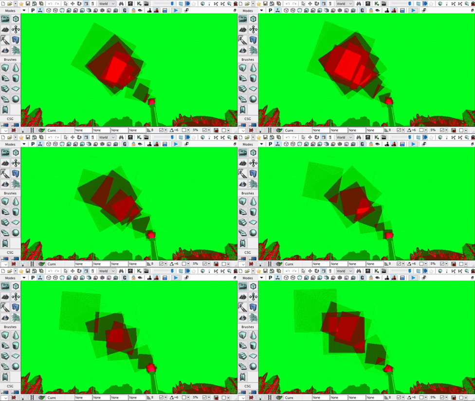
What is Overdraw? This happens when the game engine is spending time re-rendering portions of the screen due to transparent objects. Rasterized renderers (Game engines) render in layers. All of the opaque objects can be simplified into one layer (it's actually more complex than that but for simple explanation of overdraw lets say its one layer) But now you have added smoke stacks particle effects on some areas of the map.The area on screen where the particles are visible have to be rendered multiple times. I do mean multiple times, as in more than twice. Why? Each sprite in the particle that overlaps another needs to create another layer to render the overlap. This issue can become exponentially worse with high spawn rate particles.
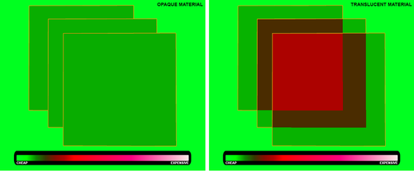
Opaque materials will not have this issue as there is no need to re-render what’s behind layers. Transparent / opacity masked materials on the other hand do require what’s behind them to be rendered multiple times. Again the more layers of transparency, the more times it needs to re-render.
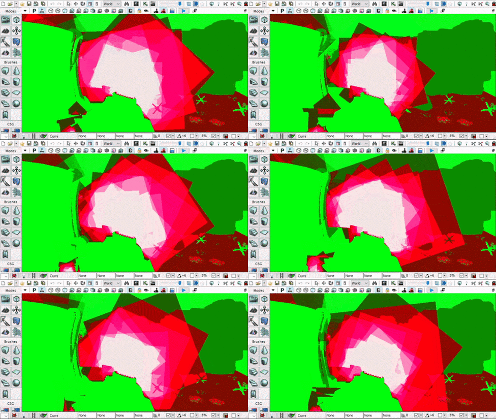
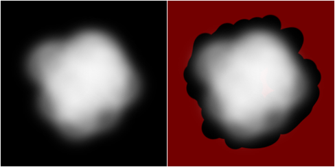
One of the biggest causes of overdraw is the large amount of negative space on the mesh that is completely invisible. In the image below you can see how a smoke texture has a lot of negative space that has zero detail.
Unfortunately for particle effects there isn't much that can be done to resolve this.Your best for optimizing particles is to keep the sprites as small as possible, and keep their spawn rate as low as possible. REMEMBER! Overdraw is exponential on performance. The more layers are on top the more exponentially longer the rendering times will become.
On meshes however we can drastically minimize the effects of overdraw by simply trimming the mesh to be as close as possible to the texture to remove as much negative space as possible.
Let's take a look at grass planes as an example. The geometry is adjusted to remove as much of the negative space while still being a very low poly mesh. Notice how compared to the particle sprite gifs above, the grass is only having to do a small amount of overdraw. So when making custom transparent meshes, make sure you keep this in mind.
Overdraw can very quickly and very easily become one of the most taxing computations that the game engine has to do because it literally means re-rendering parts of the already rendered frame again because of transparent layers on top. So handle this with extreme care. Limit this as much as possible by using smaller and less frequent particle effects, and tighter geometry around alpha textures.
Use Cases
- Material / Shader optimization
- Identify overdraw problem spots in your map
- Both extremely performance heavy elements that should be prioritized!
Light Map Density
Next up we have a very important debug view that can help drastically optimize your file size and memory footprint for your maps. Finally we’re going to talk about Light maps as I mentioned much earlier in this documentation. The “Light Map Density” debug mode is yet another heat map based view mode. Similar to the Texture Density view mode, this view mode will highlight the texal density of light maps on all of your objects.
What are Light Maps?
UDK / UE3 is not particularly great at handling dynamic lights especially with larger objects that you would see in cases of level assets and environments. So the game engine can pre-calculate the effects of lights onto a texture that can be applied on to each object individually. Imagine if all of the light and shadows on a rock were captured on a texture based on the Rock’s UVs, and then applied onto the object’s emissive channel while the object itself is not being lit up at all by any light source.
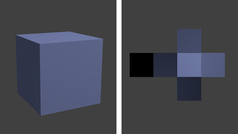
The image above is a quick example of how this works. This cube is technically not receiving any lights, but rather the light and shadows are painted onto a texture which is applied directly to that object. The higher the resolution of the light map texture, the more crisp and detailed the shadows and lighting results will appear, as shown in the image below
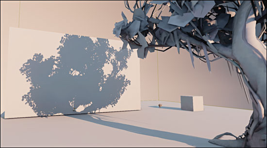
I hope you are still keeping the texture video memory description in mind because this is where it matters a lot. Because light maps are textures, they are fed directly into video memory. Which means you cannot create high resolution light maps without consequence, and the consequence is the infamous “Ran out of video memory” crash. Also because they are textures, your file sizes will become bloated very very quickly if you’re not careful.
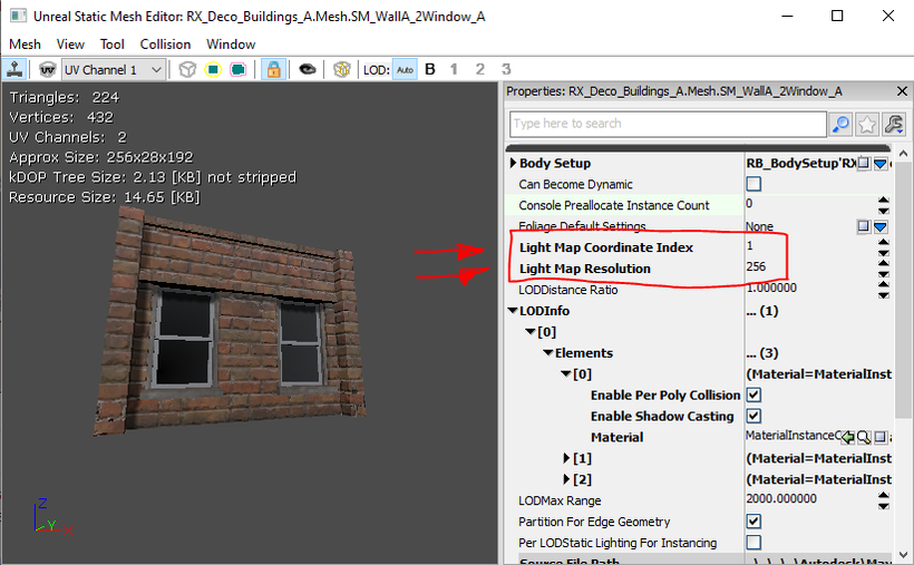
Light maps resolutions should always be set to a resolution of “Power of 2”. For the reason explained above regarding video memory. You must always make sure that the “Light Map Resolution” values in your static mesh are always set to a value of a power of 2 in order to maximize memory usage, and minimize any waste. You should also use the secondary UV channel for lightmaps (Default is channel 0 which is used for material textures). The “Light Map Coordinate Index” value can select any secondary UV channel your mesh may have.
How to optimize Light Maps
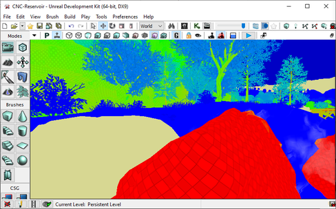
Light map density mode will display a heat map ranging from blue (very optimal), all the way to red (very expensive). On top of that this view mode also displays objects that do not have any light maps as a faded beige colour as seen in the image above. This is caused by the static object not having any UVs setup for light maps.
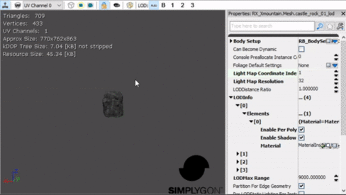
Let's take a look at the same mesh in the static mesh viewer. This mesh is set to use a different UV channel for light maps as displayed by the “Light Map Coordinate Index” value being set to 1. But when we display UVs for “UV Channel 1”, it doesn't show any UVs. This is because this mesh is not set up to have any secondary UV channel.
This does not however mean that it won't use static lighting. If this is the case, then this mesh will instead use vertex colour to bake in lighting. What are vertex colours? This is a colour value applied to every vertice on the object to substitute in for the lack of a light map.
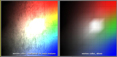
Notice how there is a colour value applied to each vertex and blends to the adjacent vertex. However the quality is always going to match the mesh’s geometry density. The denser the mesh is, the better the results will look. Vertex colours can also become pretty expensive if you go overboard with the amount of meshes and how dense they are. However if they are few and far between and a relatively low resolution mesh. Then they won't have much of an impact and are safe to use.
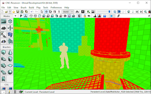
Now lets get back to light maps. Notice how every object that has Light map UVs display a checker pattern. This is visualizing “texal density” Which means how many pixels are in that light map texture in proportion to the object size. Each checker square = 1 pixel.
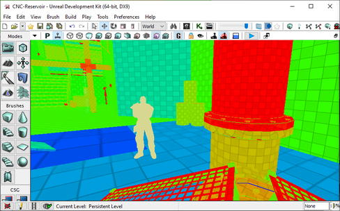
For light maps you’ll want to stay in the Blues as that ensures that you are using as small of a resolution for light maps as possible. You might think that having light maps have pixels that large will look bad, but you would be surprised as to how small you can go without much of a visual impact.
Let's take a look at a prime example of optimized light maps. Field X:
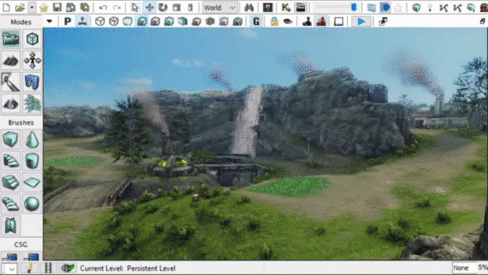
Almost the entire map is in Blue, yet it still looks well lit with zero lighting artifacts. Don’t under-estimate how low you can go with light map resolutions. Even in this case some of the few green and even a few red objects can be scaled down to be in the blue range. Now this map runs as smooth as butter on most low end computers, and has never been known to have the “Ran out of Video Memory” crash. This map is only 137mb in file size well within the optimal file size for Renegade X maps.
Let's look at another example “CNC-Reservoir”. Before (Left) it was 202mb, and now after (Right) with light map optimization it has had zero changes visually while dropping down to 141mb in file size.
The Perfect Light Map
Let's discuss how to set up the perfect light map that follows all of the rules of a light map. This will help us to identify one critical issue with “The Perfect Light Map” and why it's not always a good thing.
Rules of light maps in UDK:
- No Overlapping UVs (This must always be true)
- Must have 2 pixel buffer between UV shells (Mostly True)
- UV Vertex proportionally snapped to the light map resolution’s pixel grid (Good practice)
- UV shells are not distorted or disproportionately scaled (Very Dangerous)
- No Overlapping UVs. This means that every part of the mesh must be separated in the UVs otherwise you will have duplicating artifacts in your light maps as two different parts of the same object can be in different lighting conditions producing different results. This means you could end up having shadows from one overlapping section being projected onto the other overlapping section. So this rule must always be true. You must never overlap any UVs. Notice how the image below shows every part of the mesh separated with absolutely no overlapping.
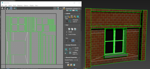
- Must have 2 pixel Buffer between UV Shells. Let's take a closer look and examine the UVs on this same object. In the image below, notice how all UV shells have 2 grid square spacing in between. The goal for this mesh is to use a light map resolution of 256. So therefore the grid displayed is matching the resolution by having 256x256 grid lines to identify spacing.
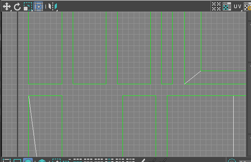
- Must snap UV Vertex proportionally to the light map resolution’s pixel grid. As mentioned the grid is set up to match 256x256. All UV shells and their vertices are snapped perfectly to every grid. This is only really possible on mostly flat 90 degree shaped objects. It would be very challenging to do this on an organic shape like a rock.
Now let's take a look at this object in UDK. We’ve set up this object to match the resolution with 256, and are using the correct UV channel. This will produce “Perfect” light maps because it follows all of the rules precisely.
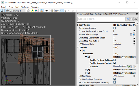
- UV shells are not distorted or disproportionately scaled. This is true for this mesh. What this means is that every part of the UV is perfectly scaled to keep consistent texal density throughout along with absolutely no distortions what so ever. Meaning if that checker pattern was overlayed, it would look flawless. This is mostly possible due to the light map resolution being set to 256x256 to allow us to have enough room to perfectly fit UVs with zero distortion and disproportionate scaling.
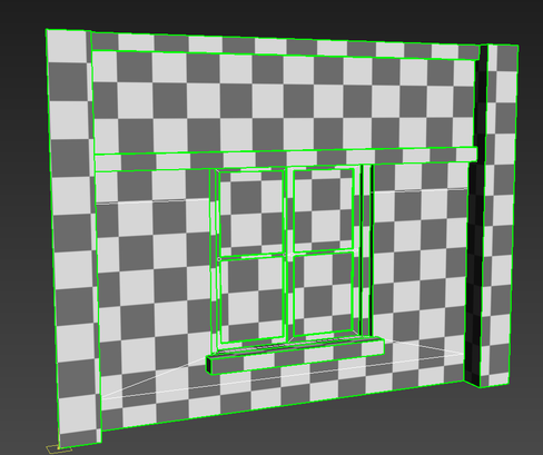
But this can be very very dangerous from an optimization perspective. Lets jump into the editor and see what this looks like, and why this is a really really bad idea.
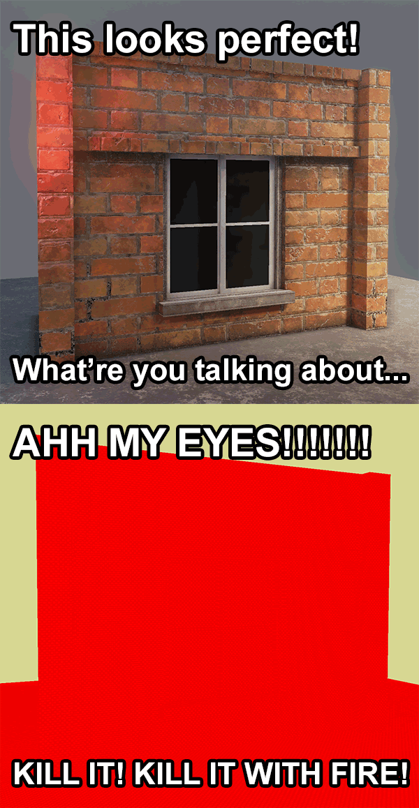
As we switch to light map density view, you can see exactly what the issue is. Under “perfect” light map set up rules, the performance can take a major hit. This is just a 256x256 resolution light map, and yet even in this screenshot it’s hard to make out that checker pattern. Texal density is very important to manage for video memory performance. One solution you could try (But work work well) is to reduce the light map resolution down to blue. Lets see what that looks like:
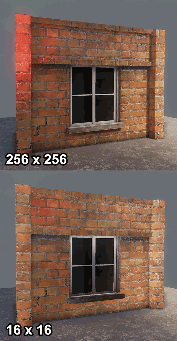
Ugh… Not so great. Lost a lot of detail. Why does it look so bad at 16x16? Well for one it’s significantly lower resolution. You will have to compromise visual fidelity when reducing light map resolutions. You will never be able to keep the same results with lowest resolutions. You will have to accept that stability and performance outweighs visual fidelity.
The Not So Perfect Light Map
You can still however improve the quality of the low resolution light map UVs by not following the light map rules to the letter. Focus on large high visibility areas. You can also distort and manipulate your UVs to not follow the grid snapping rules within reason. You will have to find the right balance yourself. Let's take a look at the distorted UVs of this same mesh to support 16x16 light map resolution.
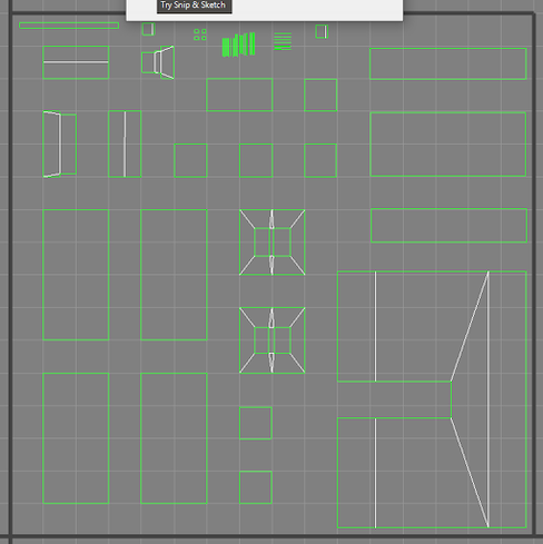
By no means is this clean, and it makes me cringe. But it's something that I know I have to live with. Now lets compare the results inside UDK.
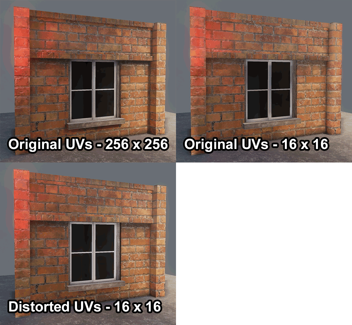
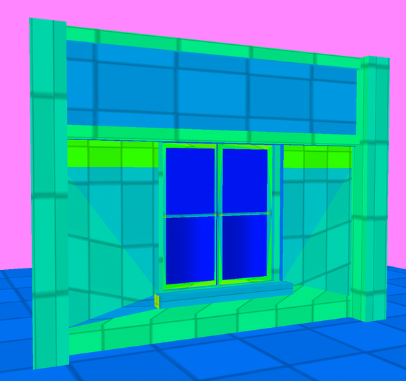
By manipulating the sizes of the UV shells to better support the larger more visible faces, I managed to also get the important larger sections of the mesh in the green range. While still having an ultra low resolution light map for a moderately sized object.
This example is also a worse case scenario where the shape is very linear with perfect straight angles. In the case of most Renegade X maps, you will likely be running into mostly elements like rocks, foliage, and mostly naturally shaped objects. These types of objects are a lot more forgiving to reduce light map resolutions. Lets take a look at a mesh I’m sure we’re all very familiar with:
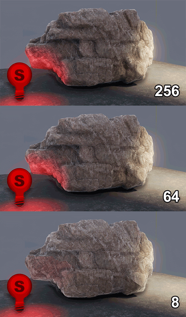
So the lesson is go as low as you can before you start to look wrong/broken. Do your best to get to the Blue range in the Light Map Density view mode. Definitely avoid any orange or reds. Blue to Green is your optimal range.
Lighting Only with Texal Density
I won't go over the “Lighting Only with Texal Density” view mode as its basically just the same as the “Light Map density” view mode but instead of a heat map as a measure, it uses the “Lighting Only” view mode as a display. It also adds the checkerboard texture to visualize the light map resolution. I find the “Light Map Density” view mode to be far more beneficial.
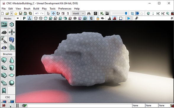
This covers all of the view modes that you need to become familiar with in UDK for optimizing your maps in Renegade X. Remember that they can help you debug everything from performance and optimization, all the way to visual quality improvement. This is a powerful tool set, use it!
Foliage Optimization
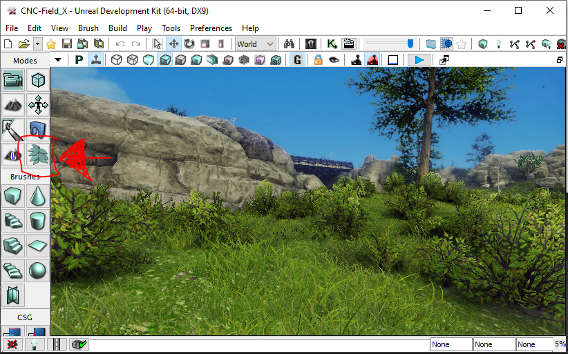
Managing your foliage is very important for video memory. The Foliage tool will merge a cluster of foliage into a single object and hence also a single light map. It will do this by combining the light maps of individual foliage instances into one larger light map texture. By default the foliage tool is set to cluster 100 instances. But this poses a problem. Lets do some simple math.
- Grass Mesh light map resolution = 8 by 8
- 100 instances of grass mesh will create a light map texture = 800 by 800
- 800 pixels is not a power of 2
- Therefore this will waste video memory space since it will need to place an 800 x 800 light map into a 1024 x 1024 memory block texture
How do you solve this? Set the number of cluster instances to a power of 2. For example instead of 100 clusters, the cluster group can be set to 64. 8 times 64 = 512. Therefore our lightmap for the 64 cluster is 512 x 512 and thus fits perfectly into video memory.
In the foliage tool, select the 3rd button on the top left in with the icon that looks like the letter “ i “. This will open up cluster settings. Here you can define how many instances to have in a cluster group. You can also define culling distances which is very important for keeping the number of actors drawn on screen to be as low as possible
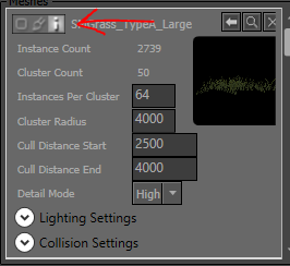
.
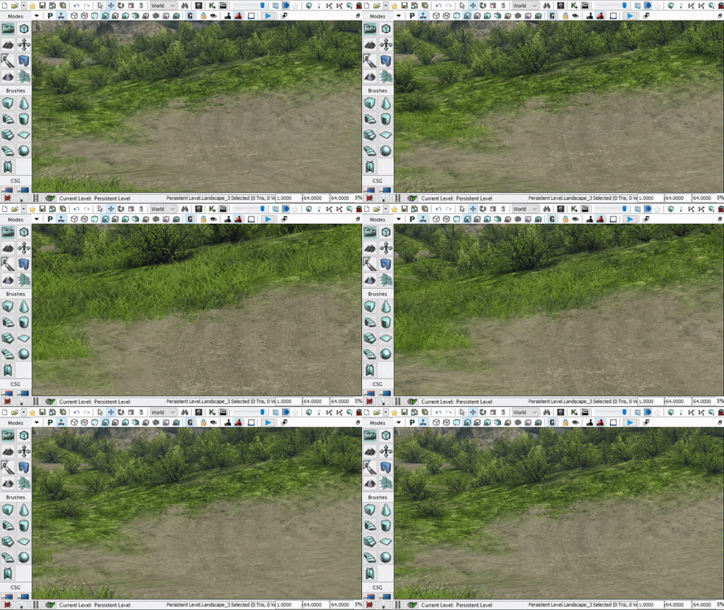
You are also able to define detail level visibility in the same menu. You can set certain foliage to be hidden at high and medium settings by defining their “Detail Mode” to High, Medium, or Low. This is great for making the map less heavy for people who have to set their graphics settings to low.
Precomputed Visibility
What is precomputed visibility? This is a substitute for bounding box / distance based culling. Culling is to remove/hide objects that are far away in the distance or hidden behind other objects. Dynamic Culling is the engine’s default. Although not necessarily bad for performance, it can become taxing if there are a lot of objects in your scene. To mitigate the need to process every object on every frame, UDK has a pre-calculated system similar to how light maps are pre-calculating lighting.
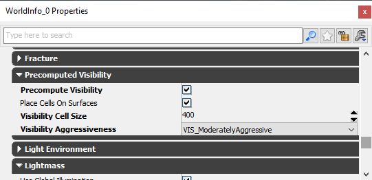
In this case however we can pre-calculate which objects to cull when in various locations in a map. This is done by first enabling “Precomputed Visibility” in your level’s world properties. What this will do is create metadata that stores whether to hide or display every object based on the camera’s position in the level.
The system once enabled will create a grid of cells. These cells are small cube shaped volumes that are sitting on the level geometry. The size of these cells are defined in the world properties settings as “Visibility Cell Size”. The smaller the cells the more cells the engine will have to generate. The larger the cell the fewer it will need to generate. Both have their pros and cons. “Visibility Aggressiveness” defines how harsh the culling will be. This acts as a buffer if very low, and at high can be less forgiving to objects that are just within the visible range.
There are a lot of pros and cons to this system. On the one hand it’s able to clear up a large number of computations that happen in real time on every frame to determine whether to hide or display an object. However this system also creates an abundance of metadata that all gets saved in your map’s file. If mishandled, this will DRASTICALLY bloat your map’s file size. As you all know by now, that’s bad.
Precomputed Visibility is managed via the “Precomputed Visibility Volumes”. These are volumes you can place in the scene to dictate where the cells will be generated. DO NOT PLACE A GIANT VOLUME THAT COVERS THE WHOLE MAP! Okay now that that’s clear, it's important to reduce the number of these cells that will get generated. The last thing we want to do is overburden the engine by having to load a tonne of metadata as a trade off of reducing realtime culling calls. You should only place localized small volumes in areas of the map where there will be more traffic. Let's take a look at Field X again.
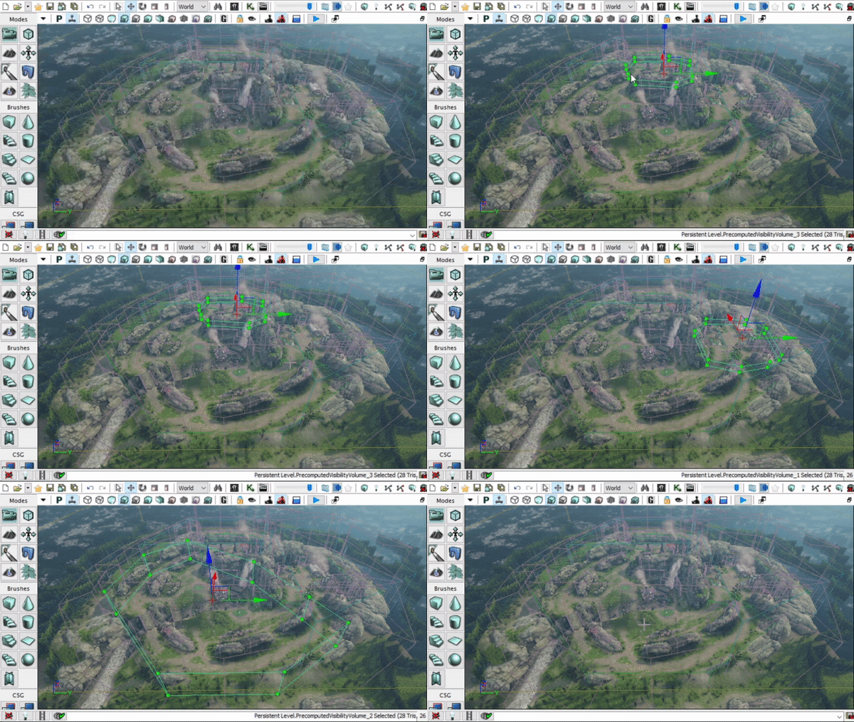
Notice how there are smaller volumes localized to each area of the map. For example the GDI Base, Nod Base, Field, Tunnels, etc.. Try to keep these volumes to a minimum as we dont want to tax the game engine to have to load a lot of metadata for culling.
General guideline:
- Create smaller volumes that encompass localized areas of the map
- Do not go below 400 units for cell size
- Do not create one large volume that encompasses the entire map
- Do not worry about covering every part of the gameplay space in your map
Draw Calls
What are Draw Calls? Where do I begin… It's complicated. This falls under the rasterized renderer which is how video game engines make pretty pictures as final frames. A draw call is a series of processes on the CPU which is then sent over to the GPU to render them on a per pixel level. So for example 5 rocks meshes will be processed in 5 Draw Calls.
Now let's say we have a Renegade X building asset. Technically still a single static mesh, but contains a tonne of different materials for different tiling textures. This one build mesh for example could have 10 materials. Because there are 10 materials, each material needs to be handled in a separate draw call on the entire mesh. So this same mesh is now going to have to go through 10 separate draw calls to process each material individually on that one static mesh. This ends up becoming a heavy load for both the CPU and GPU.
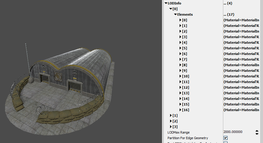
Let's take a look at the GDI Barracks. It contains 17 different materials. This means this mesh has to go through the CPU and GPU 17 times to be able to render correctly. In case it wasn’t obvious. That’s bad.
What does this mean for making maps? For making a map itself it means you need to not only have fewer meshes (actors) in the scene, but those meshes also need to have the fewest possible number of materials. Unfortunately there is no debug view for this so this is a bit of a manual process in UDK. It's more so up to you as you develop your map. Keep an eye out for how many different meshes exist in the level, as well as how many materials each mesh has.
Now this image has a guideline for the number draw calls for a PC/Console game. However these numbers are also based on modern game engines. Divide this number by 2 and it's more or less what the limits for UDK are. Every mesh in your map is added to draw calls. So it's best to keep the number of different static meshes to a minimum. As well as their materials down to as few as possible. Because they can multiply and get out of control very quickly.
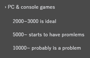
So managing the amount of objects in your level is very important! If you don't, your CPU will have a heart attack and the game will slow down and potentially even crash. We wouldn’t want that now would we!
Conclusion
Now that you understand a little more about theory and practice about how performance plays a role and how to manage it properly. You should now be able to optimize your maps in a way that should make them extremely stable and also allow for high frame rates. Feel free to google more about individual topics as that will drastically help you get a lot more information on specifics.
